ICT Chart Setup on TradingView: Clean Smart Money Layout for Beginners 2026
- Published On: 20/01/2026
Join Our Telegram Channel

Most beginners don’t struggle with ICT because the concepts are hard. They struggle before they even start learning properly — the moment they open their charts. Too many lines. Too many indicators. Too many colors. And still no clear answer to one simple question: what is price doing right now?
When a chart looks messy, the mind also becomes messy. You hesitate. You feel unsure. You enter trades late or exit early. Slowly, trading becomes emotional instead of logical. Many traders then say, “ICT is confusing.” But the truth is simple — the chart setup is confusing, not ICT.
ICT does not begin with entries, signals, or indicators. It begins with clarity. A clean chart helps you focus only on price. When there is less on the screen, it becomes easier to see highs, lows, structure, and important levels. You stop guessing and start understanding.
Retail traders usually build charts that tell them when to buy or sell. ICT traders build charts that help them understand what is happening in the market. That is a big difference. An ICT chart is not made to predict the market. It is made to observe price clearly so future decisions feel logical, not stressful.
This guide will help you create a simple and clean ICT chart setup on TradingView. By the end, you’ll know how to remove unnecessary tools, organize your chart properly, and build a setup that supports market structure, liquidity, and session timing. This is not a trading strategy. It is the base that makes learning ICT easier and less confusing.
An ICT chart is not a signal machine. It is an observation environment. Its job is to help you see price clearly so you can understand what the market is doing before thinking about entries.
ICT charts are not designed to tell you buy here or sell here. They are designed to show context. When your chart is set up correctly, you observe how price forms highs and lows, where it pauses, where it expands, and how it reacts around important areas. This removes guessing and builds understanding.
An ICT chart includes only what supports clarity:
Everything on the chart must have a purpose. If it doesn’t help you read price, it doesn’t belong there.
Just as important is what an ICT chart intentionally removes:
These tools often slow learning. They encourage reaction instead of observation and create dependence instead of skill.
When the chart is simple, learning becomes faster. Your eyes start recognizing structure naturally. Liquidity behavior becomes clearer. Confidence grows because your understanding comes from price itself, not from tools telling you what to do.
An ICT chart does not trade for you. It teaches you how to see — and that is the real edge.
TradingView is more than enough for ICT traders, especially at the beginner and intermediate level. ICT does not require complex software, expensive platforms, or broker-specific tools. It requires clear price data, flexible timeframes, and simple drawing tools, all of which TradingView provides in one clean environment.
One of the biggest advantages of TradingView is how easy it is to move between multiple timeframes. ICT analysis is top-down by nature. You may study structure on the daily or 4-hour chart and then drop down to lower timeframes for detail. TradingView makes this smooth and fast, without disrupting your analysis flow.
The built-in drawing tools are another reason TradingView fits ICT so well. Horizontal lines, boxes, and rays are all you need to mark swing highs, swing lows, liquidity areas, and Fair Value Gaps. There is no need for custom indicators or add-ons to read price correctly.
Replay mode is especially valuable for learning ICT. It allows you to practice reading structure and liquidity candle by candle, without risking real money. This builds experience faster and removes emotional pressure.
For beginners, the free plan is enough. You don’t need paid features to build a proper ICT chart. As your experience grows, you can upgrade later, but skill always comes before subscriptions.
Most importantly, TradingView encourages consistency. Using one platform daily trains your eyes and builds familiarity. In ICT, consistency is what turns observation into skill.
Most importantly, TradingView encourages consistency. Using one platform daily trains your eyes and builds familiarity. In ICT, consistency is what turns observation into skill.
In ICT trading, a clean chart is not about looks. It is about how clearly you can think. A messy chart creates confusion, hesitation, and emotional decisions. When the chart is crowded with indicators, colors, and random drawings, the brain has to process too much information at once. This leads to overthinking, late entries, and poor exits. Simply put, messy charts create messy thinking.
ICT follows a very different mindset from retail trading. Retail traders often build charts that try to predict the market. They add indicators hoping for confirmation or signals. Institutional traders do the opposite. They remove everything that distracts them from price. Their charts are built to observe behavior, not to force decisions. The cleaner the chart, the easier it is to understand what price is doing and why.
Think of your chart like a workspace. A cluttered desk slows you down. You spend time searching instead of working. A clean desk allows you to focus, move faster, and make better decisions. Trading works the same way. When your chart is clean, your attention stays on price, not on tools fighting each other for your attention.
Clean charts naturally improve patience. When there are no signals shouting at you, you stop feeling the need to trade every move. You wait. You observe. You let price come to important areas instead of chasing it. This patience leads to better execution because trades are taken with intention, not impulse.
Execution also becomes calmer. Entries feel logical instead of rushed. Stops are placed with structure, not fear. Losses are easier to accept because the decision process was clear. In ICT, clarity always comes before strategy. When the chart is clean, everything that follows becomes simpler.
Chart appearance may look like a small detail, but in ICT trading it plays a big role in clarity. The way candles look, the background you use, and how colors are applied all affect how easily you can read price. A clean visual setup reduces distraction and helps your brain focus on what actually matters.
ICT uses candlestick charts because they show intent and behavior clearly. Each candle tells a short story about price.
Strong candles help you spot displacement, while weak candles reveal hesitation or balance. This makes it easier to separate real institutional movement from noise. Candlesticks allow you to read price directly, without interpretation from indicators.
The background should support visibility, not compete with price. Most ICT traders prefer a simple dark background because it reduces eye strain and keeps candles easy to read. Light backgrounds can also work if they are clean and minimal.
The goal is simple: price should be the most visible thing on the chart.
Colors in ICT charts are not for decoration. They are used for organization. Each idea should have one clear color, and that color should remain consistent.
Changing colors often may feel harmless, but it breaks visual memory. Consistency trains your eyes faster than any tool.
When candles, background, and colors are disciplined, your chart feels calm. And when the chart feels calm, execution becomes calm too.
In ICT trading, timeframes are not used randomly. Each timeframe has a specific role. When beginners mix timeframes without purpose, charts become crowded and structure starts to contradict itself. ICT avoids this confusion by following one simple rule:
Context comes first. Precision comes second.
Higher timeframes like the Daily and 4H charts are used to understand the big picture. This is where you slow down and observe what the market is trying to do overall. On these charts, you are not searching for entries. You are answering foundational questions:
Higher timeframes help you define bias and direction. If this step is skipped, every lower-timeframe move feels random.
Lower timeframes such as the 1H and 15m charts are used only after context is clear. Their job is not to change bias, but to show detail inside the higher-timeframe idea. Here, you observe how price behaves near important levels and how structure forms on a smaller scale.
Lower timeframes are for refinement, not decision-making.
Top-down analysis means starting from the higher timeframe and stepping down gradually. Think of it like this:
The higher timeframe is the map. The lower timeframe is the street view. You don’t choose a street before knowing which city you’re in.
Each timeframe should have its own responsibility:
One of the biggest mistakes beginners make is drawing everything on every timeframe. This creates clutter and confusion. Not every line belongs everywhere.
When timeframes are respected, structure aligns naturally. Clarity improves. And trading becomes calmer, slower, and far more logical.
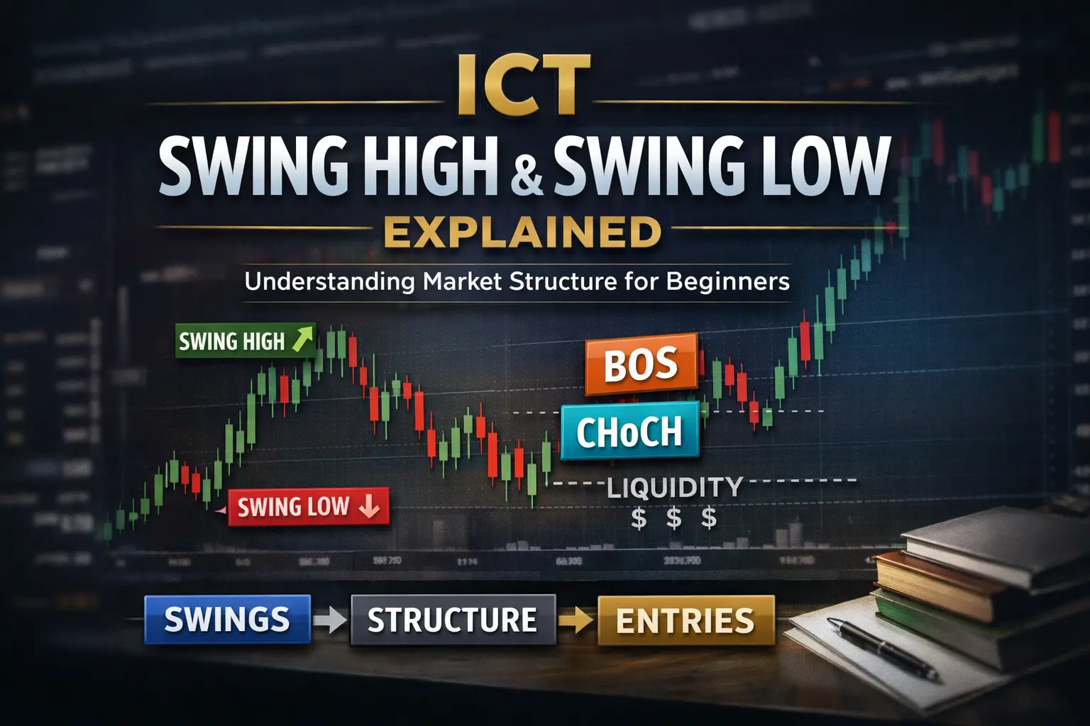
Market structure is the backbone of an ICT chart. Its purpose is not to give entries, but to give context. When structure is clear, direction makes sense. When structure is unclear, every setup feels random.
In chart setup, structure starts with swing highs and swing lows. These swings show where price changed direction with intent. A valid swing is one that is clearly visible and respected by price. Tiny pauses, noise, or single candles do not count. If you have to zoom in too much or convince yourself a swing exists, it probably doesn’t.
A simple way to think about valid vs invalid swings is this:
Beginners often fall into the trap of over-marking. Every candle becomes a swing. Every move looks important. This clutters the chart and destroys clarity. In ICT, less structure marked correctly is far better than more structure marked poorly.
Structure should also be treated as context, not an entry signal. Its job is to answer questions like:
When structure is respected, patience improves automatically. You stop reacting to every move and start waiting for price to align with the bigger picture.
Structure tells you what kind of trades are allowed, not when to trade.
If you focus on marking only clear, meaningful structure, everything else in ICT becomes easier to understand.
Liquidity is the fuel behind every meaningful market move. If liquidity is not visible on your chart, price behavior will feel confusing and unfair. Marking liquidity correctly helps you understand why price moves the way it does.
The most important liquidity levels to mark are equal highs and equal lows. These areas attract stop orders and pending orders, making them natural targets for institutions. Price is often drawn to these levels before making its real move.
Session highs and lows also matter. Asia, London, and New York sessions each build their own highs and lows. These levels often act as liquidity pools and play a role in daily price delivery.
What you should focus on marking:
What you should ignore:
When too many levels are drawn, liquidity loses meaning. When only important liquidity is marked, fake setups become easier to spot. You start to see when price is hunting stops versus when it is actually ready to move.
Liquidity clarity reduces overtrading. Instead of forcing trades, you wait for price to interact with meaningful areas. This alone filters out many low-quality setups.
If liquidity is clear, price behavior stops feeling random.
Fair Value Gaps are one of the most overused and over-marked concepts by beginners. Once traders learn what an FVG is, they start seeing it everywhere. The result is a chart filled with boxes, overlapping zones, and zero clarity. In ICT, an FVG is not something you hunt — it is something you respect when it matters.
An FVG is worth marking only when it aligns with context. This means structure is already clear, liquidity has been addressed, and price location makes sense. Random FVGs in the middle of price, during low-volume times, or against higher-timeframe bias should be ignored. More FVGs do not mean more opportunities — they mean more confusion.
When you do mark an FVG, keep the drawing clean and subtle. Use light transparency so price remains visible. The FVG should never dominate the chart. It is a reference area, not a signal zone. If the box distracts you from price, it is too heavy.
Beginners improve faster when they mark fewer FVGs, but understand them deeply. One well-placed FVG in the right context teaches more than ten random ones. Clarity always beats quantity in ICT.
Order blocks are marked to identify areas where institutions previously showed intent. They are not magic candles, and they are not guaranteed entry points. Their purpose is to give context about where smart money may have accumulated or distributed positions.
Where beginners go wrong is marking every candle as an order block. If every move becomes an OB, the concept loses meaning. Meaningful order blocks are usually found near major highs or lows, around clear structure shifts, or after strong displacement. Small candles inside ranges are rarely worth marking.
A simple rule helps: if price reacted strongly away from an area and structure confirms it, the order block may matter. If price barely reacted or constantly trades through it, ignore it.
Just like FVGs, fewer order blocks work better. One or two well-defined OBs on a chart are enough. When charts are clean, reactions become easier to see and patience improves naturally.
Order blocks are tools for location, not prediction. They support decisions — they don’t replace them.
Time is not separate from chart setup in ICT. It is a visual filter that explains why price behaves differently throughout the day. Markets do not move the same way at all times, and ignoring sessions leads to frustration and fake setups.
Each major session has a general behavior:
Session awareness does not mean drawing heavy boxes everywhere. That creates clutter. Simple session markers or vertical lines are enough. The goal is to know when price is active, not to decorate the chart.
When sessions are respected, many bad trades disappear automatically. You stop forcing entries during dead hours and start focusing only when participation is high.
Time, like structure and liquidity, adds context. And in ICT, context is everything.
One of the biggest mistakes beginners make is adding too much to their charts. In ICT, what you remove is often more important than what you add. Extra tools don’t create clarity — they usually create confusion.
Indicators and signal tools are the first things to avoid. Most indicators are built from past price data, which means they react late. They pull your focus away from price and push you toward reaction instead of understanding. ICT is about reading price behavior directly, not waiting for signals to tell you what to do.
Over-decoration is another common issue. Bright colors, thick lines, shaded zones everywhere, and unnecessary drawings make the chart visually loud. When everything is highlighted, nothing stands out. The brain gets tired faster, and decision-making slows down.
Many beginners also copy chart templates from social media without understanding them. These templates often look impressive but are filled with tools the trader doesn’t actually know how to use. A chart should support your learning, not imitate someone else’s style.
Simplicity protects beginners. A simple chart keeps emotions low, learning fast, and mistakes visible. The cleaner the chart, the easier it is to improve.
Once your ICT chart is clean and functional, saving it as a template is essential. Consistency is how skill is built in trading. When your chart looks the same every day, your eyes start recognizing patterns faster.
Saving a template removes small daily decisions like colors, layouts, or tools. This keeps your focus on price, not on setup adjustments. Over time, this creates visual memory — your brain learns what structure, liquidity, and displacement look like in a familiar environment.
Your first template does not need to be perfect. It just needs to be stable. Refinements can come later. In ICT, consistency always beats perfection.
Most chart-related mistakes come from emotions, not lack of knowledge. One common mistake is changing the chart layout after a loss. Adding tools, changing colors, or switching timeframes in response to losing trades resets learning and creates instability.
Another frequent issue is marking everything. Every swing, every level, every FVG gets drawn. The chart becomes crowded, and important information gets buried. More markings do not mean better analysis — they usually mean less clarity.
Beginners also confuse aesthetics with effectiveness. A chart that looks beautiful is not necessarily useful. ICT charts are built for function, not appearance.
The solution is discipline. Use one setup, follow the same rules, and let learning compound over time.
No. A paid TradingView account is not required to build a proper ICT chart. The free plan provides everything a beginner needs: multiple timeframes, basic drawing tools, and clean price data. Paid plans are optional and should only be considered later for convenience — never as a shortcut to skill.
ICT chart setups are designed to work without indicators. Indicators often react late and shift focus away from price. A clean ICT chart relies on structure, liquidity, time, and price behavior. Adding indicators usually slows learning and increases hesitation.
There is no single “best” timeframe. ICT uses a top-down approach. Higher timeframes (Daily or 4H) are used for context and bias, while lower timeframes (1H or 15m) are used for precision. Each timeframe has a role.
Only update markings when structure or key levels change. Over-updating creates noise. A good rule is to review structure once per session or after clear displacement. Stability builds clarity.
Yes. This ICT chart setup works for Forex, indices, and gold. The principles of structure, liquidity, and time remain the same across markets. Only volatility and session behavior may differ.
Before you start analyzing or trading, make sure your chart meets these conditions:
If even one item is missing, fix the setup first. A strong chart setup protects you from rushed and emotional decisions.
An ICT chart is not meant to give you instant buy or sell signals. Its real purpose is to build discipline, clarity, and understanding. When the chart is clean, your thinking becomes clean. You stop reacting to noise and start observing behavior.
Confidence in trading does not come from tools or indicators. It comes from repetition in a familiar environment. Seeing the same structure, the same liquidity behavior, and the same session patterns every day trains your eyes and your mind.
This is why chart setup is not a one-time task. It is a habit. The more consistent your setup, the faster your learning compounds. Losses become lessons instead of frustration, and patience replaces impulse.
Once your chart setup is stable, learning ICT becomes much easier. Concepts connect naturally because the foundation is solid.

Why ICT Trading? Scope, Myths & Step-by-Step Smart Money Guide
January 24, 2026

Connect with focused ICT learners on our Telegram. Get daily insights, updates, and clear guidance to simplify your trading journey.
Join Channel